Client Spotlight: Maur Hill – Mount Academy
Catholic-prep boarding school | 200 Students | Atchison, KS
Client Summary
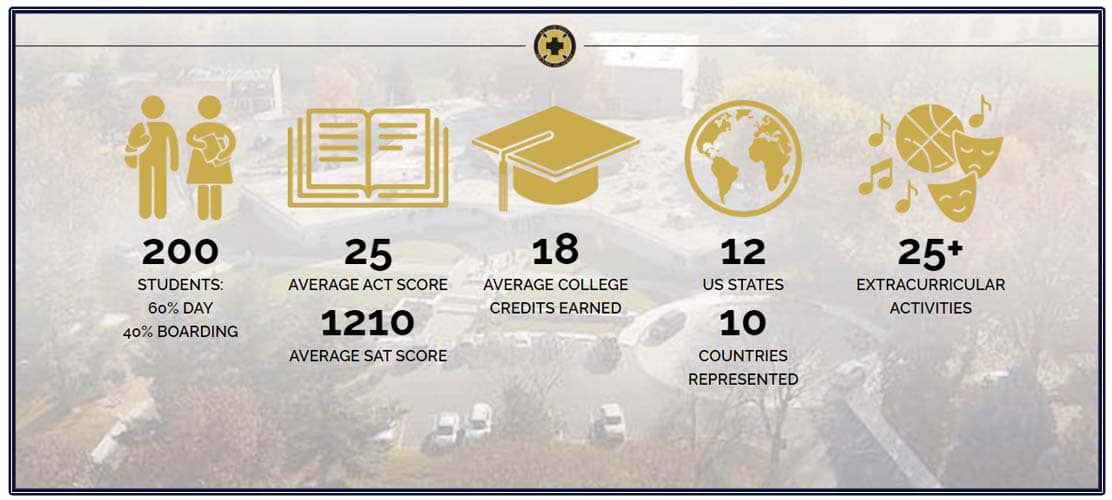
Maur Hill – Mount Academy (MH – MA) is a co-ed college-preparatory high school and boarding school. Rooted in the Catholic faith and midwestern values, MH – MA focuses on preparing graduates for their next steps towards college and life. It serves 200 students in grades nine through 12 from across the United States and around the world.
Project Overview
Maur Hill – Mount Academy is located in Atchison, Kansas, about 45 minutes north of Kansas City but has students attending from 12 states and 10 countries. As both a faith-based school and a boarding school, visibility and enrollment were priorities in designing their new website. Key components to the success of the website include quick access to important information and the ability to request more information, easy scheduling of a campus visit, and a simple application process. In addition, the director of admissions wanted a website that would boast an easy-to-navigate, attractive, responsive design for mobile viewing.
MH – MA chose a premier school website design, which allowed them total freedom to design a unique website with many custom features. School Webmasters designers are known for their ability to “find the yes” and delighted the school with a modern, captivating design.
Website Features
Homepage Video
Maur Hill – Mount Academy has a wonderful feature video that starts playing as soon as you land on their site. The school’s logo, name, and site navigation hover with a transparent background over the video that plays full screen. The video exhibits smiling students and a beautiful campus. This is a great way for MH – MA to show off their school culture and make an emotional connection with site visitors.
As you scroll down the page, the header and navigation seamlessly transition to a white background with black text for effective visibility. In the responsive mobile version of the website, to save on load time and user data, a lovely image replaces the video. Below the image, an attractive “Watch Our Video” button is prominently displayed.

Just past the video on the homepage, text and navigation boxes float in from either side to accompany photos from the school. This sleek animation draws attention to features that make Maur Hill – Mount Academy unique and adds interest to the site. The mobile version of the site loses the images but keeps this cool animation feature.
Parallax scrolling is a CSS design feature that allows background images on a website to move slower than foreground images, creating an illusion of depth. This feature is used on Maur Hill – Mount Academy’s home page, showcasing its beautiful campus along with school statistics, adding more dynamic movement to the new website.

As a private school, enrollment is high on the priority list for Maur Hill – Mount Academy. The main navigation features access to enrollment information. The information and application links are located on the left hand side of the three column dropdown menu along with images from the school and links to secondary pages.
Prominently featured on the home page are links to “visit,” “inquire,” and “apply.” The client wanted these links to really stand out, so our designers created the buttons with a “pulsing” sensation around the edges and grow when you hover over them.

Ease of navigation, to ensure site visitors would find the information they need, is crucial for this client. To this end, we added navigation breadcrumbs under the header pictures on every page.

Maur Hill – Mount Academy wants website visitors to be able to easily contact them for more information about their school. The inquiry form is an embedded form that a visitor simply completes from their desktop or mobile device. The completed form goes directly to the school.
Website Reaction
“I am really loving it! And the mobile view navigates so much better. Submitting updates – I find it extremely easy; the service portal is the easiest thing ever. The board really liked the new site. It is a huge improvement. The cell phone view is a million times better. All the features are wonderful.”
-Anne Faucett, Maur Hill – Mount Academy Director of Admissions
“The look of the mobile view was almost more important to the client than the desktop view. Our user interface director, Sarah, was able to adjust what is on the mobile view. The client did not want the logos, so they were left off. How amazing is she!?! I’m always proud of the work we do here and the people I am honored to work with. I cannot thank everyone involved in this project enough for all they did and for the completion of this amazing new site.”
-Megan Gray, School Webmasters project coordinator


