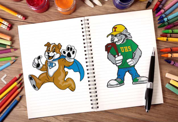
K–12 schools find it quite difficult to stand out from their competitors because most schools offer the same services. But, with the ever-increasing competition for parents and students, it is vital that schools find their place in the minds and hearts of parents with school-age children. And that, my friends, brings us to the idea of branding.
Branding goes beyond your colors and school logo, of course. It is inclusive of the entire customer experience and includes everything from your school website design and layout, your school social media interactions, and your mascot to how your staff answers the phones. Your brand is that cohesive identity that you want to solidify in your customers’ minds. It requires establishing a look and feel that supports your brand goals consistently and avoids variations that will dilute or even disintegrate your brand identity. So, let’s talk about how to use school mascots and logos to contribute to your cohesive brand identity.

Mascots
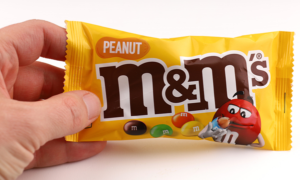
School mascots can be incredibly efficient at creating an endearing association with your customers. They basically turn any inanimate object into a character with a personality and a soul. They are often based on animals (real or mythical), humans, or even animated objects (think M&Ms).

I’ll bet you remember what your school mascot was, right? Whether you were a cougar, a bulldog, or a mustang, you probably described it not as “The mascot was a bulldog” but as “We were the bulldogs.” Even if you didn’t play sports, the school mascot was the visual representation of your sense of belonging, right?
Your mascot can and should also be tied to the storytelling aspect of your brand. Stories are what connect us to one another at the deepest levels. A mascot can do that and help the stories associated with your mascot be forever etched in your audiences’ memories. So, when you want to create strong emotional connections, your mascot can help do that for your school.
Mascots can humanize the business of education, leading a path to your customers’ hearts. The Journal of Marketing Management claims that “Brand mascots reflect a deeply rooted human tendency to understand the world through anthropomorphic objects.” By selecting a mascot that shares common values with your customers, you’re on the right track. It can be funny or playful, strong and driven, or friendly and inviting. Give your mascot the qualities that are characteristic of your school.
We highly recommend a professionally designed mascot and logo. Don’t have a student draw one or even use a staff member who dabbles in graphic design. It will be worth the extra expense to have it done right. A professional will provide you with all the necessary file types for both digital and print use. You may also request options for dark and light backgrounds (as well as black and white). You wouldn’t show up at an interview in a T-shirt and jeans because you want to make a good first impression. Your logo and mascot are often your school’s first visual impression; so do it right.
One of our client schools even designed multiple views with their mascot in a variety of poses to use for athletics, academics, socializing, as well as a few humorous situations. This provided them with the opportunity to humanize the mascot and reflect the variety of values their school represented. They used these in marketing materials, on their websites, and on athletic uniforms but didn’t degrade the mascot or branding in the process.
Businesses know that paying a one-time fee for a mascot design is one of the best investments they can make, and those mascots don’t age, retire, or do something embarrassing to harm your brand by association. Some well-known and beloved mascots that come to mind are Pillsbury’s doughboy, Planter’s Mr. Peanut, the Energizer bunny, Kellogg’s Tony the Tiger, or Android’s robot mascot (which serves as both the company mascot and their logo). Businesses often make excellent use of their mascots by creating a sense of continuity that helps their customers feel at ease and comfortable with their businesses because they are familiar and reliable. Schools should learn from these successes and use their mascots to their fullest potential.
Once it is professionally designed, establish a personality for your mascot. You can create a marketing campaign around it. Follow the lead of businesses and include your mascot in blogs, videos, and social media posts. Give your mascot its own social media page to solidify its character and engage with your students and parents. Let your mascot humanize your school brand by engaging directly with your audience. What characteristics do you want your mascot to display? Just remember that whatever qualities and attributes you give to your mascot will transfer to your school’s brand and become part of the message you send. So make them count.
Your students and staff may forget much of their school day experiences, and certainly the final scores of the homecoming football games, but they will always remember their school colors and the mascot. Put those memories to use. Endow your mascot with the characteristics you hope will shape your students and your community.

Logos
Much like mascots, your school logo can have a powerful effect on establishing trust and confidence in the services and expertise you provide. According to the National Center for Education Statistics NCES, there are more than 98,000 K-12 public schools and 34,000 K-12 private schools in the U.S., so you can use all the help you can get if you hope to stand out. The role of your school logo is to identify. It is a strategic tool that is the face of the services you offer and the promises upon which you deliver. Done right, your logo should:
- Establish instant brand recognition (be timeless)
- Create a good first impression (be memorable)
- Communicate your values (be relevant)
- Be simple (be versatile)
So, since including all four of these recommendations is easier said than done, as with the mascot design mentioned previously, use a professional designer! Since our logo designs can start for as low as $500, it is well worth it to have all the formats you’ll need for both print and digital versions in the highest quality.

Colors & Fonts
When deciding on the color, it is best to pick two or three main or dominant colors at most, and then, if you’d like, you could use other accent colors sparingly.
Your school logo can ultimately have any typeface or font you want, but it is best for schools to use clean, easy-to-read fonts so your audience will quickly be able to read who you are. Your school logo is a visual representation of your brand. Some corporations can get away with more artistic, custom typefaces that may or may not even be legible, but schools should be more concerned with appealing to the masses and making sure the fonts they choose are easy to read (and possibly ADA compliant), although as of today, the font on a logo does not need to be ADA compliant.
A good rule of thumb when picking fonts, especially when you are using more than one font, is to keep it simple. Do not use more than two fonts. Do not use trendy fonts or fonts that are hard to read. You should consider choosing a web-safe font (a font that doesn’t need to be or is already on your computer hosted anywhere else for someone to see them) or at the least a web font (https://fonts.google.com/) that is easy for others to find and free to download.
Finally, keep in mind the need for versatility. You’ll use your logo in a variety of ways, on everything from huge signage on billboards and outside of your schools to tiny logos on business cards and on stationery. If when resized the words or images become illegible or unrecognizable, they won’t do you much good. Vector files are scalable while photo images have their limits. So, planning for flexibility and design simplicity will help.

Establish use guidelines
Once you’ve developed your mascot and logo, create a quick reference guide (often called a brand guideline) that assures these assets are used correctly in all digital and print media and marketing materials. This guideline should include colors (include HEX, PMS, RGB, or Pantone) as well as any fonts used, spacing requirements, etc.
For more details about creating an effective brand guideline, review:
Posted by Tammy Carpenter, Art Director, School Webmasters, LLC.
For more articles about school branding, check out these articles:


