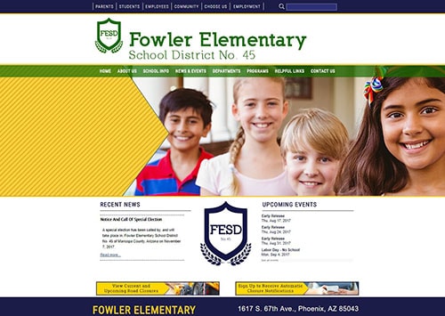
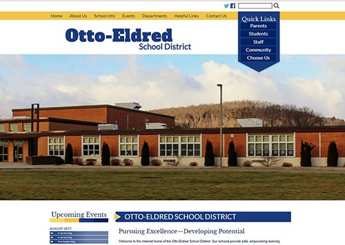
The blank canvas. The empty page. We want to fill print media with ink the same way we fill silence with words. It makes us uncomfortable, all that nothingness. If you are a customer, you feel cheated that you paid for, what exactly?
Effective use of whitespace
Many people who write and design their own websites try to cram as many things onto a page as possible. There are always services to explain, regulations to post, disclaimers to mention, and frequently asked questions to include. Many people post page upon page of single-spaced type, assuming the user will actually sit down and read it in novel-like fashion.
Content that is crammed onto a page and leaves little to no whitespace is not only ineffective, but it pretty much guarantees that no one will ever read it. You’ve lost your target audience because they are overwhelmed simply looking at the page before them. It is simply a usability nightmare for your customers (parents, prospective parents, community members, and prospective staff).
The writer’s stumbling block and artist’s nemesis is not necessarily a bad thing when it comes to web design concepts. Whitespace (or negative space) is simply space on the page that contains no content, words, pictures, or graphics. It could be space between columns, line-spacing, letter spacing, margins, padding, gutters, and even space around images and graphics. In fact, incorporating whitespace can actually help your audience access the information in your school’s website.
Effective use of whitespace allows your site visitors to chew and swallow between bites. And, just because it is called whitespace doesn’t mean it has to be white. The effectiveness of whitespace to maximize focus, emphasis, and organization on a website with a black background, for example, would be plenty of black space around blocks of text or design elements, which just as effectively guides the eye to the content you want them to see or read.
Benefits of whitespace in your school website
- Guides the eye.
When readers glance at a school website, whitespace cues them on where to start reading. Whitespace in the margins helps lead the reader’s eye along each sentence, while space between paragraphs leads the reader to continue down through the text. Whitespace breaks up a page of black or grey text, making it easier on the eye, giving you a chance to hold the reader’s attention before they get tired. - Allows the reader to focus on what is important.
White space allows the reader to focus on important visual cues, such as bullets, headings, font styles, type size, and photos. These design elements help the reader organize the information in a meaningful way. Most school website users scan for information using headings and titles. Making sure there is enough white space to focus on those cues helps your audience access your information. - Allows the reader access to all the information.
The “more is better” philosophy is a myth. Trying to cram all the information you can into a small space turns the reader off, and you’ve accomplished nothing. Sometimes more is just more, making your school websites noisy and overwhelming. Readers will actually read text and information they can access easily. Using whitespace can help keep a reader on your web page, reading. It can also improve reading comprehension. Keep this in mind for document attachments (like PDFs) as well since these are often so text heavy. - Draws attention to calls to actions (CTAs)
Marketing types know that it is important for CTA buttons to be prominent if you expect to convert leads. For a school, these leads are in the form of new student registrations, attracting staff, and engaging parents. Whether a teacher application or student enrollment forms, there are calls to action to get these forms filled out. Providing good use of whitespace means they will stand out from the rest of the page and be easier to find and complete.
Take a good look at websites you like to frequent and surf. How do those sites employ whitespace? What about websites you avoid because they are difficult to read and navigate? How do they use whitespace? You may find that your own school website isn’t as effective as you thought. Finding a way to embrace the space will help you make your website as effective as possible.
The goal is to avoid the clutter so typical of most school websites and replace it with a balanced, easy-to-navigate site where your visitors can find what they need quickly and intuitively.


Just for fun, this is a good example of what to avoid and believe it or not, it represents the Yale University’s School of Art.
Website typography & readability
Another important aspect of an effective school website design and usability is an effective use of web typography. Not only has web typography gotten much larger, the page-load speed has become a critical factor in the success of your site (especially when it comes to good search engine optimization and being found on the web). By creating a clutter-free site, a responsive website design, using web fonts and content-first page loads, you are creating an aesthetically appealing and uncomplicated user experience for your school site visitors. Doing so nearly ensures they will have the patience to stay on the site long enough to find the information they seek. After all, isn’t that the purpose of a school website?
Website typography affects your site’s readability. For the purposes of this article, we’ll be referring mostly to what is called macrotypography, which is a big word referring to the readability and design of paragraphs and the page. The best school websites will attempt to make their website a positive reading experience, which is part of creating a great user experience (UX). If your school website has poor readability, you’ll find that your site visitors will be confused and frustrated. But, when it is a great reading experience, they won’t notice a thing except that they feel like your site is engaging and helpful. That is a big win-win!
Typography tips:
- Font type. Use fonts that are easy to read, which will depend on where the text is used. For example, headlines are shorter and easier to scan, so you can get a bit creative on your font choice, but be sure you use both capital and lowercase letters because the height difference makes scanning easier. For longer blocks of text, use sans serif fonts. Standard sans serif fonts that are easy to read on a screen include Arial, Helvetica, Lucida Sans, Trebuchet, and Verdana.
- Font size. Because you are going to, of course, design for a responsive website (since your site visitors are going to be using a wide range of devices and screen resolutions to view your school site), you will want to use percentages rather than fixed heights. (We actually use viewport units for our school websites rather than percentage, but for our purposes here, just know that it allows for flexibility based on screen resolution.)
- Contrast. Another factor in readability is the contrast between background and text. Not only is this an important factor in your ADA website compliance, which requires a contrast ratio of at least 4.5 to 1 in most situations, but having too little contrast can make reading especially difficult and tiring for the eyes. Avoid bad color combinations like blue on red or white on yellow. This also applies to busy background images that can decrease readability.
- Line length. While we typically don’t mind reading longer lines of text for our print media, shorter is better on the web. If your typical lines are longer than 70 characters (depending on font size), consider turning them into columns to avoid scaring your visitors off. The idea is to allow the reader’s eyes to flow easily from the end of one line to the beginning of the next. Another assist to your readers is to use shorter paragraphs, which will also help your readers with scanning (some say 75% of site visitors would rather scan than read word for word).
- Header usage. Using headers effectively is essential to readability. They are vital to hierarchy, which is the guide for readers about where to read. Headers assist in scanning and differentiate sections from body text. Headers are typically indicated by size and boldness. When using headers and titles, be sure to use H tags rather than just bold or italics to maintain ADA website accessibility standards.
- Website content readability. Keep in mind that your typical site visitor reads at a 7–8 grade level (not an insult, just a fact about the average reader’s comfort level).The best way to be safe and keep people reading is to make sure your content is conversational (after all, this is a conversation you are having with your site visitor), avoid the use of educational jargon, and don’t require people to pull out a thesaurus to understand what you are trying to say. You’re not trying to prove to anyone that you have an advanced degree—just communicate in a friendly and inviting way. And you don’t need to feel like you are “dumbing” things down because even highly literate audiences prefer easier-to-read copy.
In summary, keep in mind that the purpose of your school website is to improve communication, tell your stories in an engaging manner, and make the visit to your schools’ websites enjoyable and painless. Keep your content scannable using whitespace, headers, and smart font choices, and keep your website content conversational and avoid education jargon. When you follow these best practices with your school website design and layout, you’ll be making huge strides in having an inviting and effective school website.
Tammy Carpenter, Art Director


